Here are top ten Google Font combinations for clean and professional look of your website in 2018. The list contains of 5 serif and 5 sans-serif fonts.
Catamaran

Catamaran is polished yet relaxed sans font developed by team lead by Pria Ravichandran, type designer from India. Font name refers to twin-hull boat. It currently contains different 9 text weights, and Latin, Tamil and Latin Extended languages supported.
Catamaran is featured in more than 80,000 websites. To embed basic version of this font in your project, use this code:
<link href="https://fonts.googleapis.com/css?family=Catamaran" rel="stylesheet">
Lato

Lato is a sanserif typeface that covers 2300+ glyphs per style, and currently supports more than 100 Latin-based languages, more than 50 Cyrillic based languages, as well as Greek and IPA phonetics. It is designed by type designer Łukasz Dziedzic from Poland. He used classical proportions to give the letterforms familiar harmony and elegance. The semi-rounded details of the letters give Lato a feeling of warmth. Font contains nine different weights. Don't miss that beautifully crafted hairline style.
Lato is featured in more than 11,000,000 websites. To embed basic version of this font in your project, use this code:
<link href="https://fonts.googleapis.com/css?family=Lato" rel="stylesheet">
Montserrat

Montserrat is a “libre sans text typeface for the web, inspired by the signage found in a historical neighborhood of Buenos Aires”. Type author is Julieta Ulanovsky, and project originates from successful Kickstarter campaign. Font is named by one of oldest neighborhoods in Buenos Aires.
Montserrat is featured in more than 4,700,000 websites. To embed basic version of this font in your project, use this code:
<link href="https://fonts.googleapis.com/css?family=Montserrat" rel="stylesheet">
Rubik

Rubik is a sans serif designed by Philipp Hubert and Sebastian Fischer, as part of the Chrome Cube Lab project. Font features slightly rounded corners, it is available in 5 weight families with Roman and Italic styles, and also there's Rubik Mono One available, which is monospaced version of the font. Hebrew language is added in 2015, and Cyrillic in 2016.
Rubik is featured in more than 190,000 websites. To embed basic version of this font in your project, use this code:
<link href="https://fonts.googleapis.com/css?family=Rubik" rel="stylesheet">
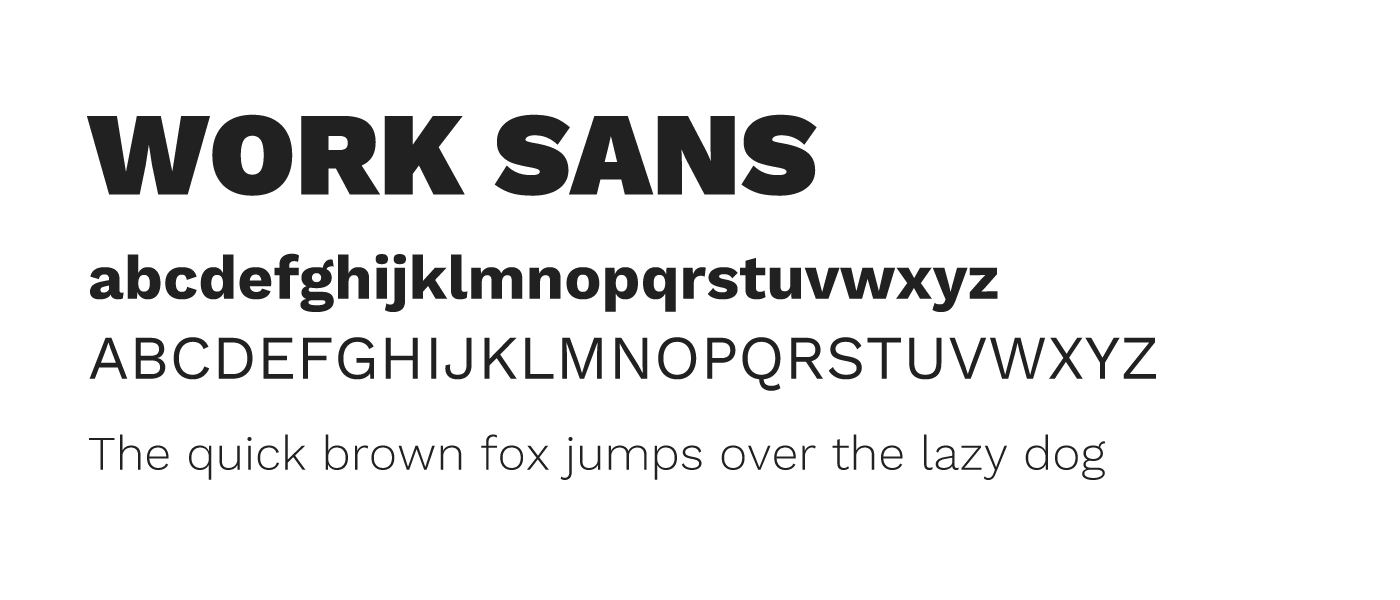
Work Sans

Work Sans is a typeface family based loosely on early Grotesques, such as those by Stephenson Blake, Miller & Richard and Bauerschen Giesserei. The Regular weight and others in the middle of the family are optimized for on-screen text usage at medium-sizes (14px-48px) and can also be used in print design. The fonts closer to the extreme weights are designed more for display use both on the web and in print. Overall, features are simplified and optimized for screen resolutions; for example, diacritic marks are larger than how they would be in print. A version optimized for desktop applications is available from the Work Sans github project page.
Work Sans is featured in more than 2,100,000 websites. To embed basic version of this font in your project, use this code:
<link href="https://fonts.googleapis.com/css?family=Work+Sans" rel="stylesheet">
Libre Baskerville

Libre Baskerville is a web font optimized for body text (typically 16px.) It is based on the American Type Founder's Baskerville from 1941, but it has a taller x-height, wider counters and a little less contrast, that allow it to work well for reading on-screen.
Libre Baskerville is featured in more than 3,100,000 websites. To embed basic version of this font in your project, use this code:
<link href="https://fonts.googleapis.com/css?family=Libre+Baskerville" rel="stylesheet">
Merriweather

Merriweather was designed to be a text face that is pleasant to read on screens. It features a very large x height, slightly condensed letterforms, a mild diagonal stress, sturdy serifs and open forms. There is also Merriweather Sans, a sans-serif version which closely harmonizes with the weights and styles of this serif family. The Merriweather project is led by Sorkin Type, a type design foundry based in Western Massachaussets, USA. To contribute, see github.com/EbenSorkin/Merriweather
Merriweather is featured in more than 3,000,000 websites. To embed basic version of this font in your project, use this code:
<link href="https://fonts.googleapis.com/css?family=Merriweather" rel="stylesheet">
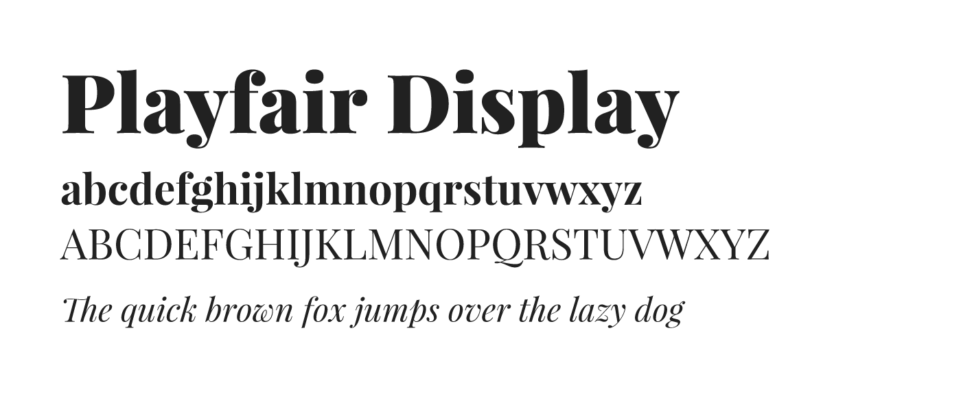
Playfair Display

Playfair is a transitional design. In the European Enlightenment in the late 18th century, broad nib quills were replaced by pointed steel pens as the popular writing tool of the day. Together with developments in printing technology, ink, and paper making, it became to print letterforms of high contrast and delicate hairlines that were increasingly detached from the written letterforms. This design lends itself to this period, and while it is not a revival of any particular design, it takes influence from the designs of John Baskerville and from ‘Scotch Roman’ designs. Being a Display (large size) design in the transitional genre, functionally and stylistically it can accompany Georgia for body text. This is the main family, with a sibling Playfair Display SC small caps family. The main family downloaded font files include a full set of small caps, common ligatures, and discretionary ligatures. Updated November 2017 with many small improvements and additional language support. The Playfair project is led by Claus Eggers Sørensen, a type designer based in Amsterdam, Netherlands. To contribute, see github.com/clauseggers/Playfair-Display
Playfair Display is featured in more than 3,500,000 websites. To embed basic version of this font in your project, use this code:
<link href="https://fonts.googleapis.com/css?family=Playfair+Display" rel="stylesheet">
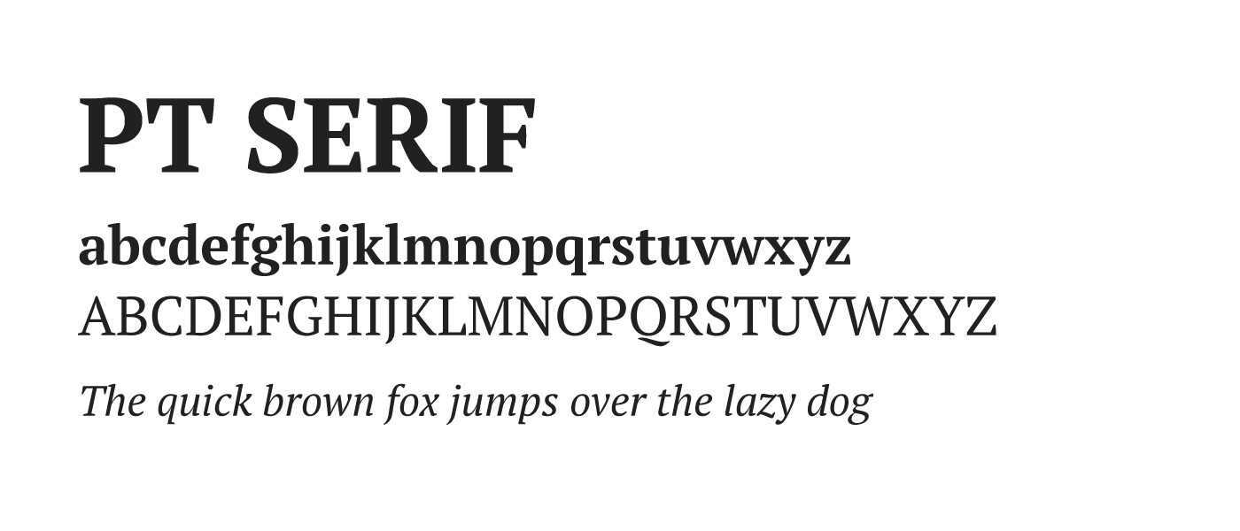
PT Serif

PT Serif™ is the second pan-Cyrillic font family developed for the project “Public Types of the Russian Federation.” The first family of the project, PT Sans, was released in 2009. The fonts are released with a libre license and can be freely redistributed: The main aim of the project is to give possibility to the people of Russia to read and write in their native languages. The project is dedicated to the 300 year anniversary of the civil type invented by Peter the Great in 1708–1710. It was given financial support from the Russian Federal Agency for Press and Mass Communications. The fonts include standard Western, Central European and Cyrillic code pages, plus the characters of every title language in the Russian Federation. This makes them a unique and very important tool for modern digital communications. PT Serif is a transitional serif typeface with humanistic terminals. It is designed for use together with PT Sans, and is harmonized across metrics, proportions, weights and design. The family consists of six styles: regular and bold weights with corresponding italics form a standard font family for basic text setting; two caption styles in regular and italic are for use in small point sizes. Designed by Alexandra Korolkova, Olga Umpeleva and Vladimir Yefimov and released by ParaType in 2010.
PT Serif is featured in more than 970,000 websites. To embed basic version of this font in your project, use this code:
<link href="https://fonts.googleapis.com/css?family=PT+Serif" rel="stylesheet">
Vollkorn

Vollkorn came into being as my first type designing attempt. I published the Regular in 2005 under a Creative-Commons-License. Until the counter finally collapsed two years later it had been downloaded thousands of times and used for web and print matters. It intends to be a quiet, modest and well working text face for bread and butter use. Unlike its examples in the book faces from the renaissance until today, it has dark and meaty serifs and a bouncing and healthy look. It might be used as body type as well as for headlines or titles. »Vollkorn« (pronounced »Follkorn«) is German for »wholemeal« which refers to the old term »Brotschrift«. It stood for the small fonts for every day use in hand setting times.
Vollkorn is featured in more than 480,000 websites. To embed basic version of this font in your project, use this code:
<link href="https://fonts.googleapis.com/css?family=Vollkorn" rel="stylesheet">
Other Blog Entries
#Technology
Understanding the basics of Big Data and its potential for businesses
Author Srdan Stojkovic 12 Oct 2018
The Pros of Human Translations vs. Machine-Generated Translations
Author Marsmedia HQ 01 Sep 2023


